· fonts · 17 min read
28 Best Fonts for Book Covers in 2026
28 book cover fonts by genre, from romance scripts to thriller displays, fantasy serifs, and non-fiction typefaces for self-published authors.
Choosing fonts for book covers means matching typography to genre and reader expectations. A romance cover needs warmth, a thriller needs tension, and a fantasy cover needs scale. The 28 fonts below are organized by genre, each with a preview, practical tips, and a direct download link so you can start designing your book cover today.
What Makes a Great Font for Book Covers?
Book cover fonts do more than make a title pretty. They tell a reader what kind of story they are about to buy. A romance cover should feel warm before the blurb is read. A thriller cover should feel tense. A fantasy cover should feel large enough to hold a world. A non-fiction cover should feel trustworthy.
Most readers first see your cover as a small rectangle on a phone, often around 100 to 160 pixels wide. If the title turns into a decorative blob, the cover loses the click. I usually aim for a title that takes up roughly 40 to 60 percent of the vertical space. Keep letter spacing generous enough to stay readable when shrunk. This is the single biggest reason a gorgeous font on a full-size mockup can quietly kill sales once it goes live on a real Amazon or Kindle listing.
Typography also sends a genre signal. A soft script suggests romance. A sharp geometric display suggests sci-fi. A distressed face suggests horror. A confident serif suggests literary or non-fiction authority.
The title should carry the strongest visual weight. The author name and subtitle should stay quieter and easier to read. If you plan to sell your book on KDP, in print, or as an ebook, confirm that the font license allows commercial use before you publish. There is no single best font for a book cover. The strongest choice is the one that matches your genre, reads at thumbnail size, and gives the title a clear visual role.
Best Fonts for Romance Book Covers
Romance covers usually need a softer voice. Script and handwritten faces feel personal, intimate, and a little emotional. That works for sweet romance, contemporary rom-com, and covers that want to feel like a love note rather than a poster.
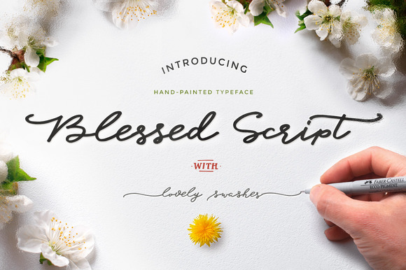
1. Blessed Script — by Blessed Print
A warm handwritten script with soft loops. It reads like a love note, which makes it a good fit for tender, emotional romance covers. Set it large for the title and pair it with a plain sans-serif for the author name so the softness does not turn into clutter.
Best for: sweet romance titles, wedding-themed romance novels, emotional love-story covers. By: Blessed Print
2. Boulevard — by Telllu
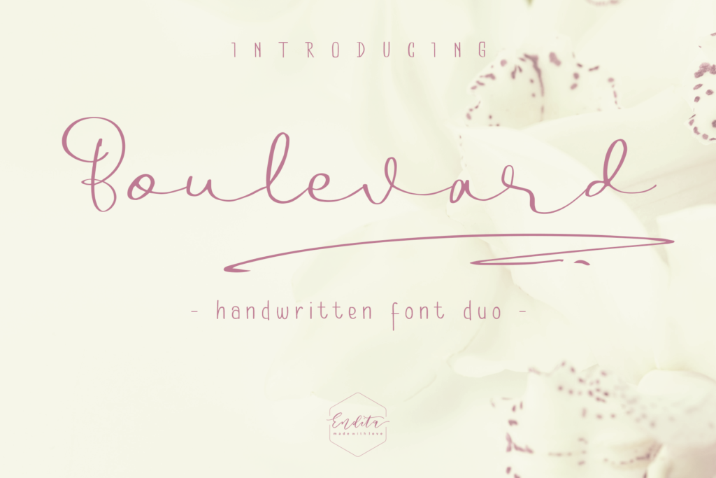
This italic script feels polished but not overdone. It works for contemporary romance, chick-lit, and covers that need a feminine touch without tipping into sweetness. Because the strokes are relatively upright, it also holds up better than looser scripts once the cover shrinks to thumbnail size.
Best for: contemporary romance titles, chick-lit covers, feminine lifestyle romance. By: Telllu
3. Endless Love — by Umitype
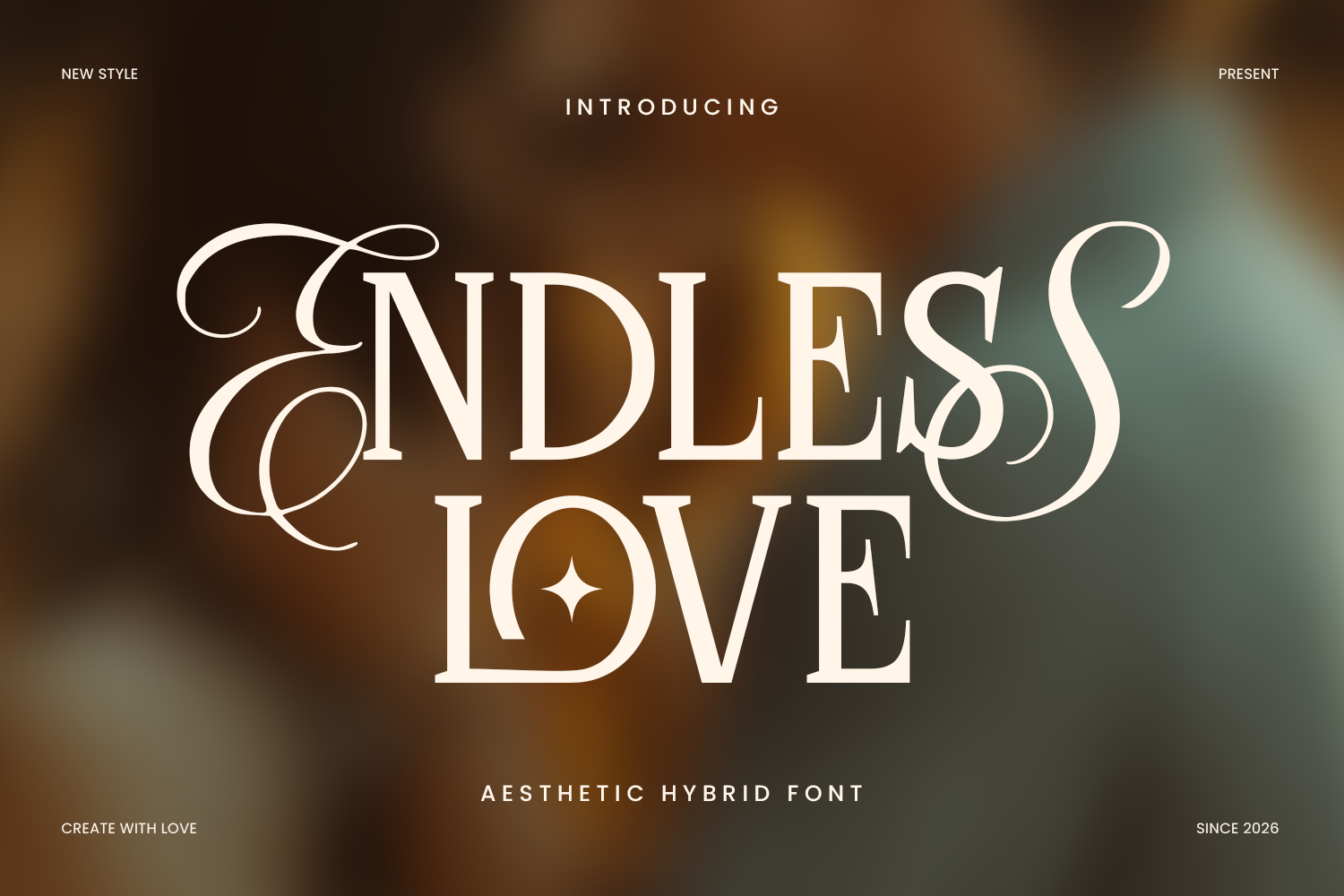
The swashes give this script a lot of room to breathe. That makes it useful for epic love stories, second-chance romance, and titles that need a little drama. Give the swashes space in your layout rather than cramming the title against the trim edge, or the flourishes will look clipped.
Best for: epic love stories, second-chance romance, emotional saga titles. By: Umitype
4. Atelier Blossom — by getstudio
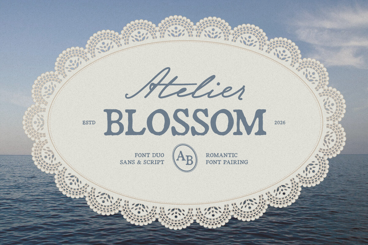
This brush script has a soft floral feel. It pairs nicely with botanical art and cozy small-town romance covers. Keep the background art a shade lighter or darker than the letters, since brush scripts like this one lose contrast fastest against busy florals.
Best for: cozy romance, small-town romance covers, floral/botanical romance branding. By: getstudio
5. Sweet Nothings — by Denise Chandler
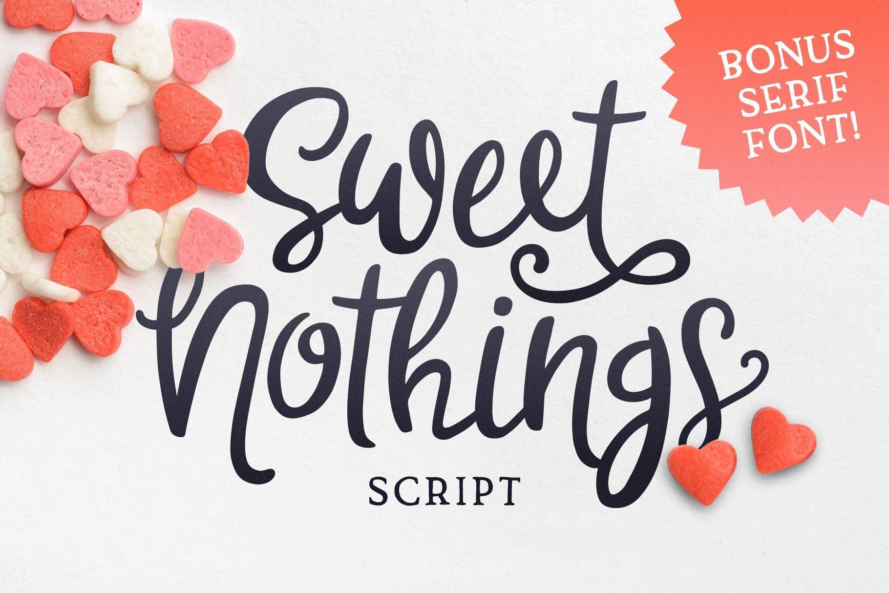
The slightly uneven letterforms make it feel handwritten rather than polished. That suits sweet, clean romance and feel-good rom-com titles. The casual rhythm also reads well next to a photo-real cover, where a stiffer script would feel out of place.
Best for: sweet/clean romance, YA romance covers, feel-good rom-com titles. By: Denise Chandler
6. Forever Together Duo — by figuree studio
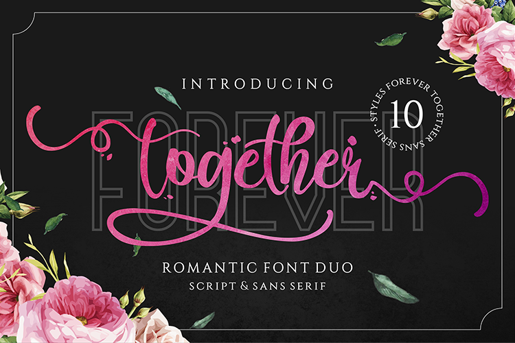
This is a ready-made font pairing instead of a single script. You get a romantic title face and a supporting face in one download. That saves the guesswork of hunting for a second font that matches the mood without competing with the title.
Best for: wedding romance series, dual-font title/author pairing, romantic anthology covers. By: figuree studio
7. Hey Molly — by Dani (7NTypes)
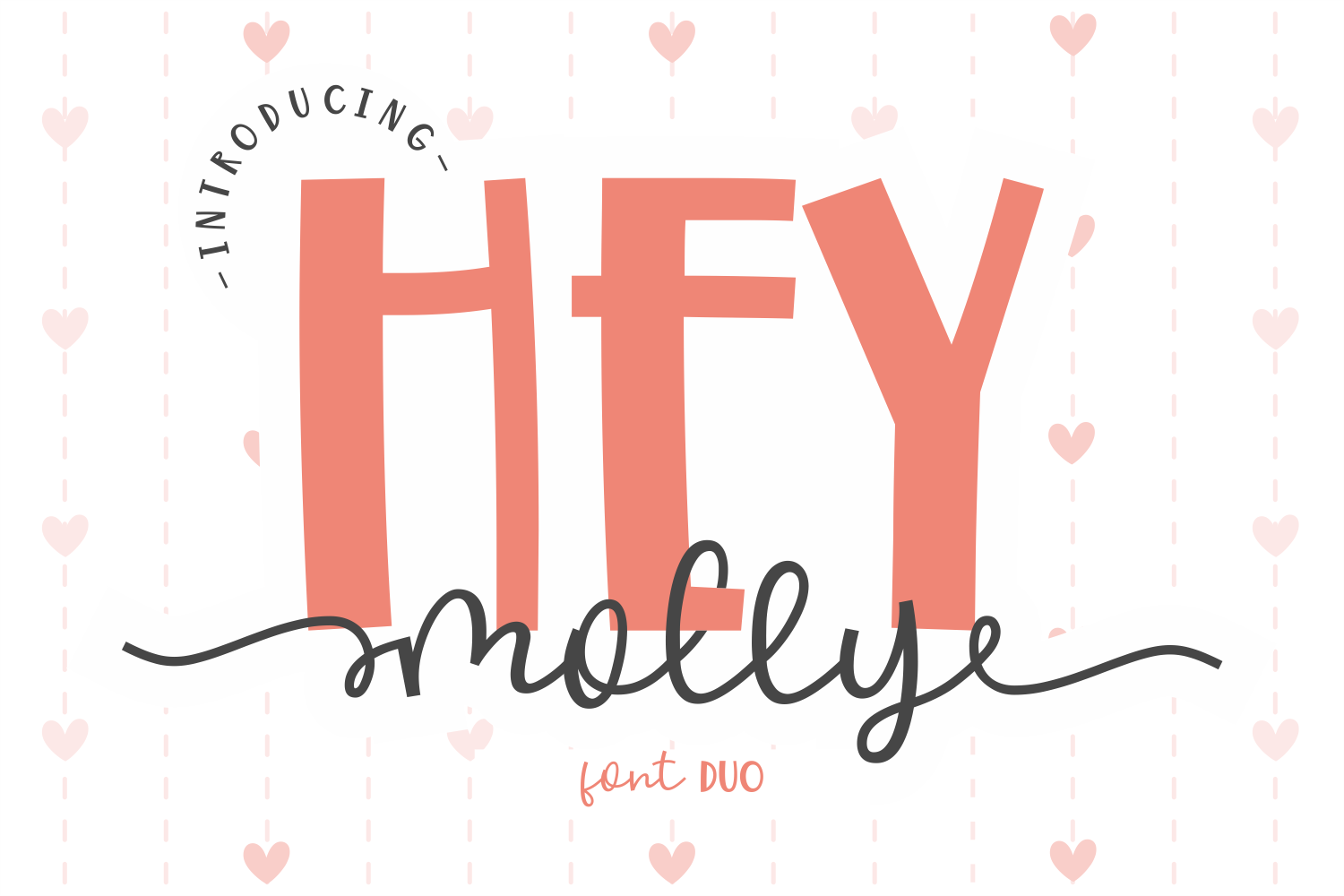
This casual script has a bouncy rhythm that feels playful. It suits rom-com covers and dating-themed series that need a little humor. It works especially well across a series, since the same bouncy voice can carry from book one to book five without feeling repetitive.
Best for: contemporary rom-com titles, playful romance series, casual dating-themed covers. By: Dani (7NTypes)
Best Fonts for Thriller & Horror Book Covers
Thriller and horror covers need a sense of danger. Some fonts do that with strict, tense letterforms. Others lean into texture, distortion, or damage so the cover feels unsafe before the reader even reads the blurb.
8. Blood Ink — by 29Graphic
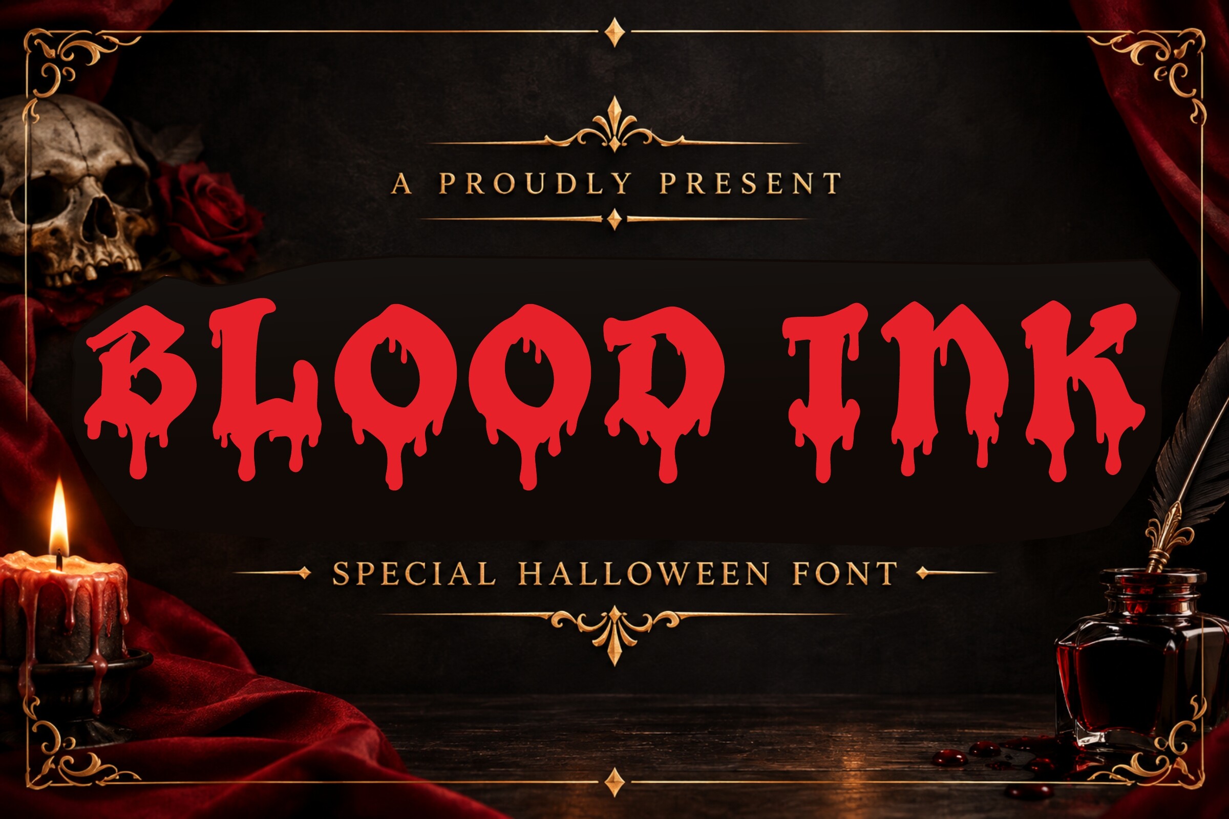
The dripping ink effect is direct. It signals horror, crime, or gritty suspense from the first glance. Because the drips add visual weight at the bottom of each letter, give the title extra vertical room so the effect does not collide with the author name below it.
Best for: slasher horror titles, crime thriller covers, gritty psychological suspense. By: 29Graphic
9. Bloodlust — by Vadova Std
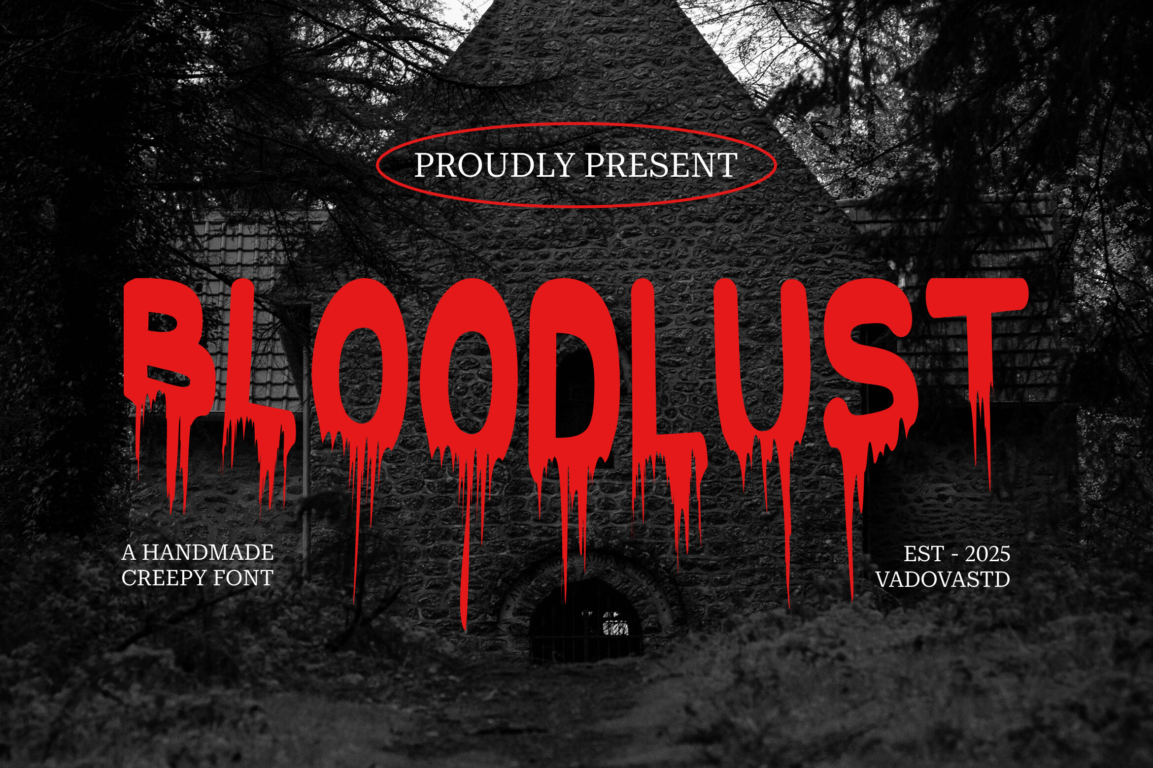
This jagged display face has a lot of aggression. It works for vampire horror, monster fiction, and dark fantasy with a sharper edge. Keep the supporting text minimal here, since a busy subtitle would fight with letterforms this sharp.
Best for: vampire/monster horror titles, dark fantasy horror crossover, aggressive thriller branding. By: Vadova Std
10. Psychodrama — by NoahType
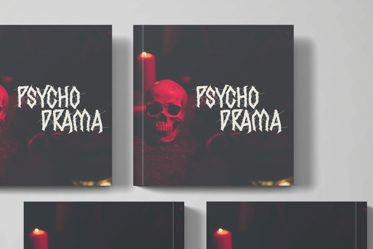
The distortion feels nervous rather than gory. That makes it a good fit for psychological thrillers and domestic suspense. It reads best on a muted, desaturated cover, where the unease comes from tone rather than shock imagery.
Best for: psychological thriller titles, unreliable-narrator suspense, domestic thriller covers. By: NoahType
11. Slasher — by Pian45
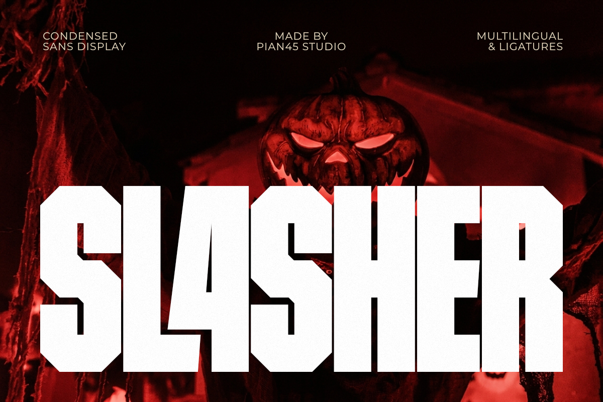
The sliced letterforms give it a retro grindhouse attitude. It is built for serial-killer thrillers and classic slasher horror. A grainy texture overlay on the cover art tends to sell the retro angle even harder once this font is in place.
Best for: classic slasher horror, serial-killer thriller titles, grindhouse-style covers. By: Pian45
12. Wraithborn — by alchemynoir
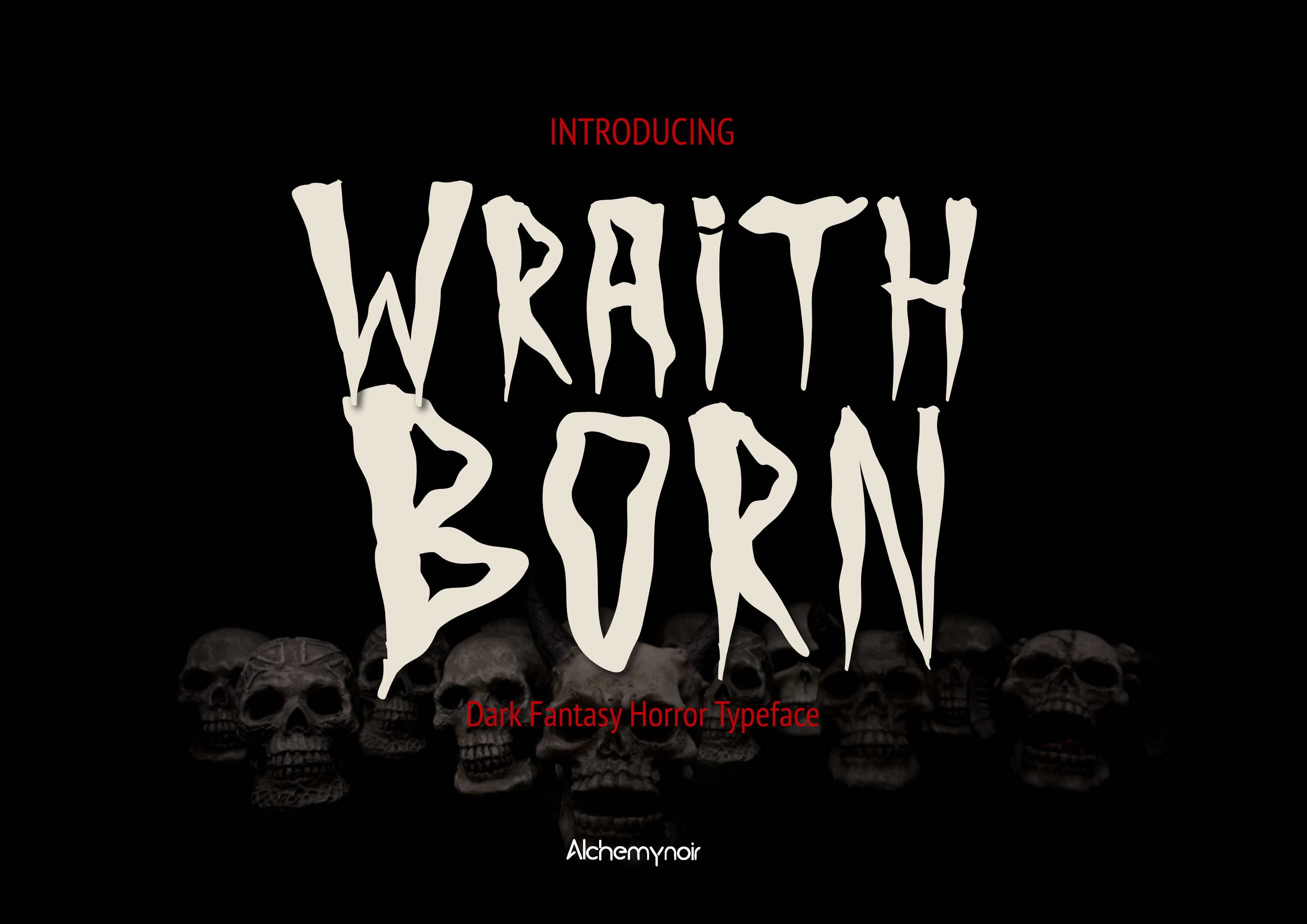
This gothic display face has a dark, otherworldly mood. It suits occult horror, supernatural thrillers, and dark academia covers. A single accent color, such as deep red or bone white, usually reads more effective here than a multi-color title treatment.
Best for: gothic horror titles, occult/supernatural thriller covers, dark academia horror. By: alchemynoir
13. Ransom Punk Note 3 — by squeebcreative
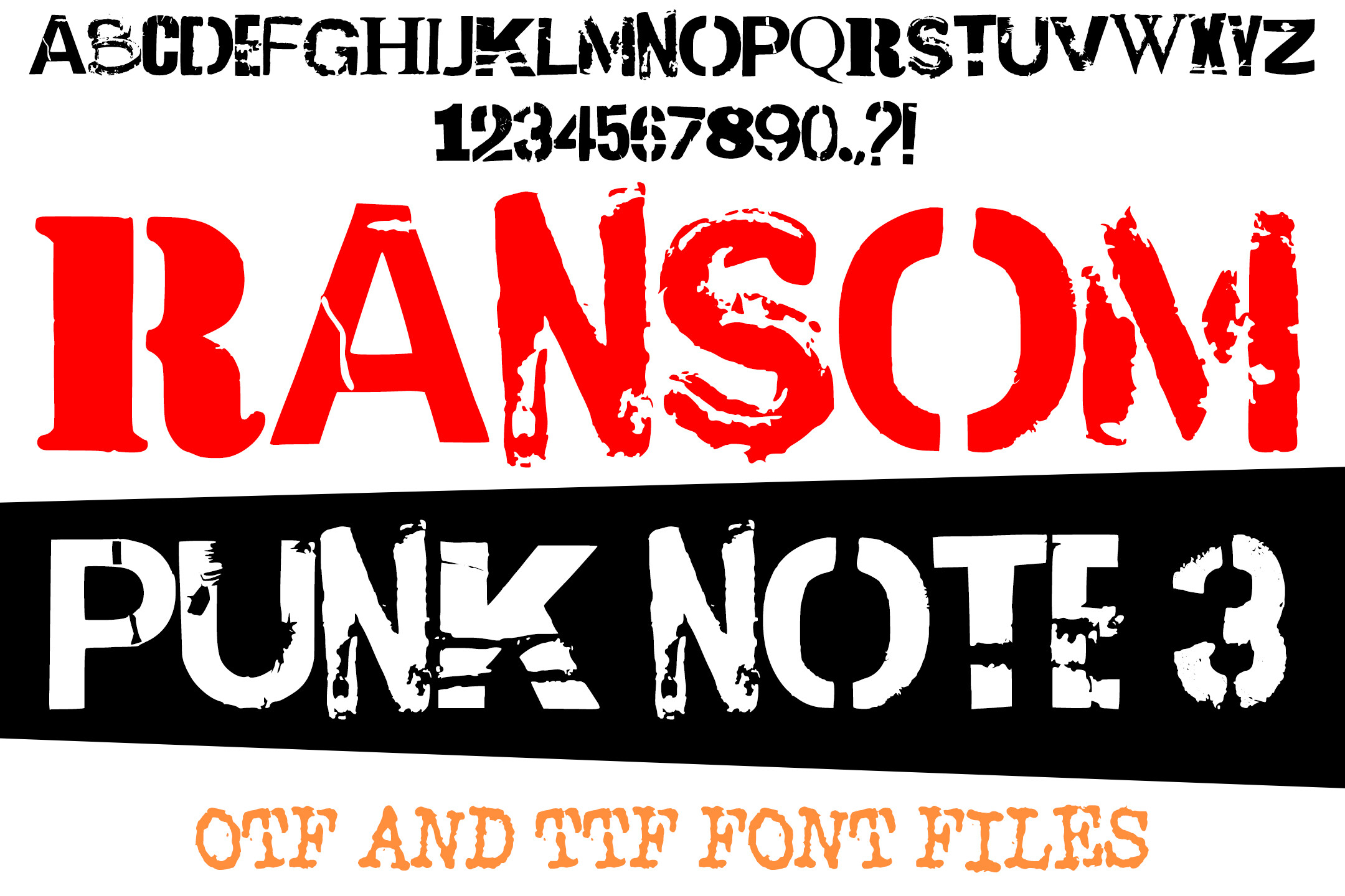
The cut-paper ransom-note style creates instant crime tension. It suits kidnapping thrillers, extortion plots, and true-crime adjacent fiction. The mixed letterforms already carry visual noise, so a plain author name underneath keeps the whole cover from feeling chaotic.
Best for: kidnapping thriller titles, crime/ransom-note thriller covers, true-crime-adjacent fiction. By: squeebcreative
14. Grimwood — by Eko Kurniawan
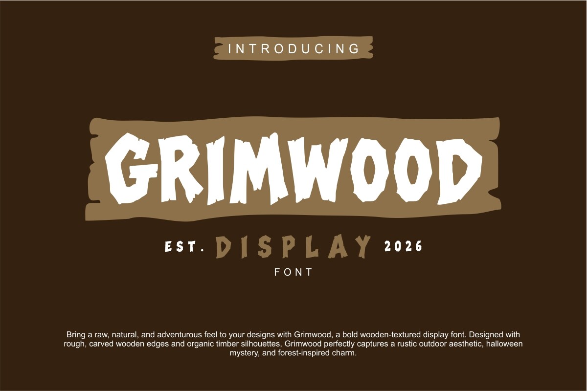
The rough, worn texture feels like something found in the woods. It suits folk horror, wilderness stories, and slow-burn atmospheric horror. It pairs naturally with earthy, muted cover palettes rather than the high-saturation reds common in slasher horror.
Best for: folk horror titles, forest/wilderness horror covers, atmospheric slow-burn horror. By: Eko Kurniawan
Best Fonts for Fantasy & Sci-Fi Book Covers
Fantasy and sci-fi both need strong display type, but they point in different directions. Fantasy often leans into historical, mythic, or regal forms. Sci-fi usually favors clean, engineered, or retro-futuristic shapes.
15. Royal Bloodline — by Pamlico Creations
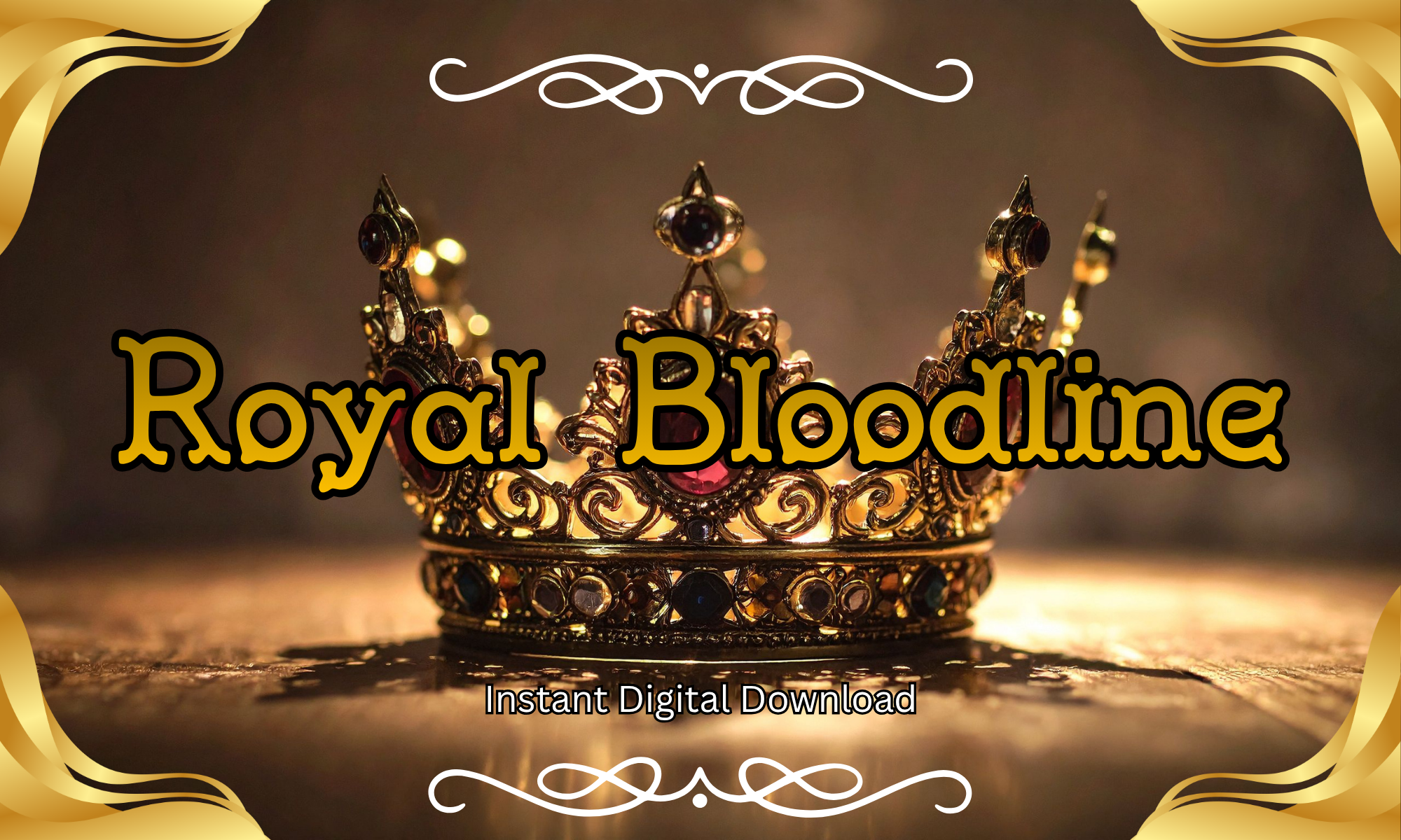
This ornamental serif has a regal, dynastic feel. It suits epic fantasy about thrones, bloodlines, and power. Reserve the full ornamentation for the title only, and let a plainer serif carry the author name so the hierarchy stays clear.
Best for: epic fantasy titles, royal/dynasty fantasy sagas, high-fantasy series branding. By: Pamlico Creations
16. Throneguard — by creativetacos
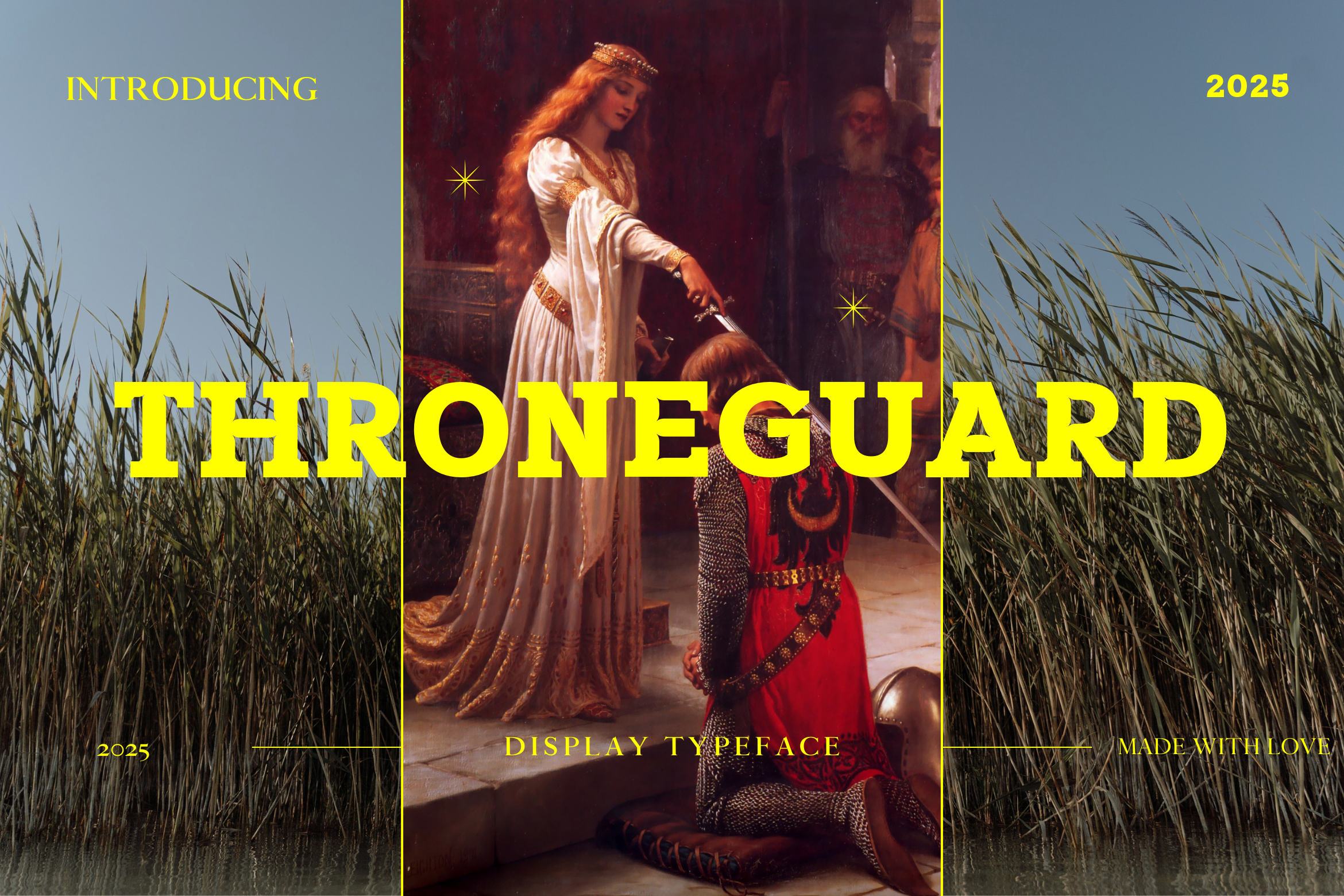
The heavy medieval letterforms feel knightly and battle-ready. It works for warrior fantasy, kingdom sagas, and epic fantasy series. The heavier strokes carry well on darker cover art, where a lighter serif would tend to disappear.
Best for: medieval fantasy titles, warrior/kingdom fantasy covers, epic fantasy series. By: creativetacos
17. Xerathos — by thomasaradea
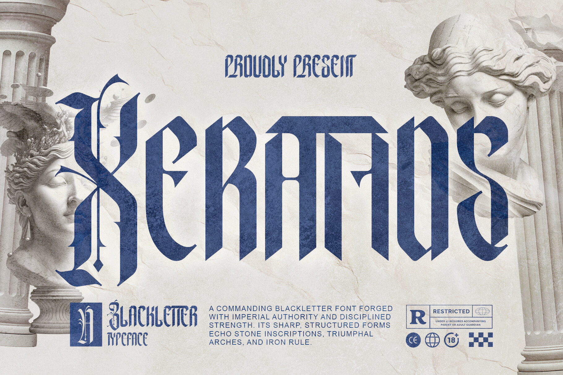
This geometric display face feels cold and precise. It suits space opera, hard sci-fi, and dystopian series. Wide letter spacing on the title reinforces the engineered, futuristic feel even further.
Best for: space opera titles, hard sci-fi covers, dystopian sci-fi series branding. By: thomasaradea
18. Auroraglyph — by OliviaFontCo
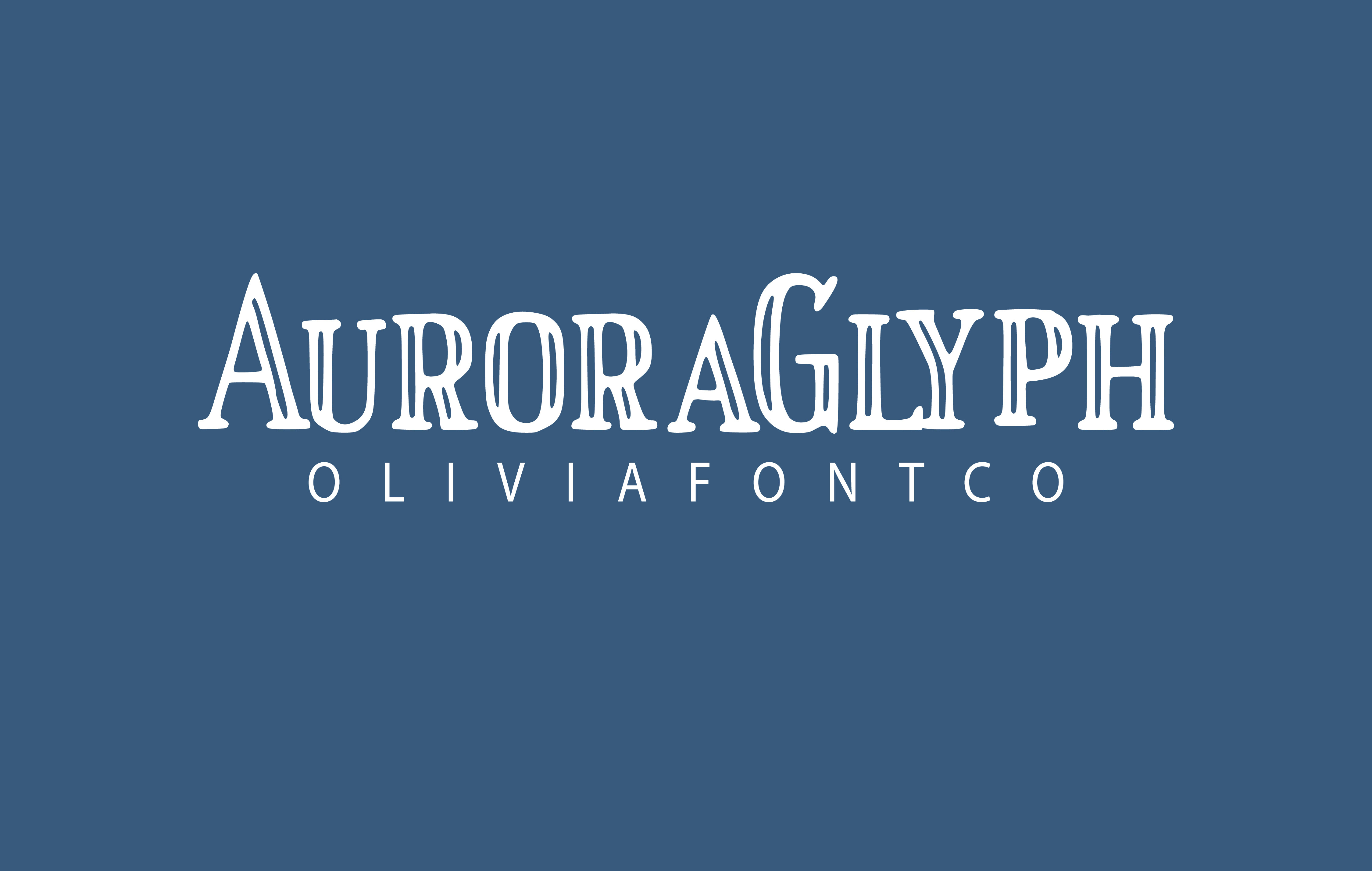
The glyph-like letterforms give it a magical quality. It suits mythic fantasy, magic-system-heavy stories, and urban fantasy. It works well as a series-branding font too, since the glyph shapes stay recognizable even when a new subtitle changes each book.
Best for: mythic fantasy titles, magic-system-heavy fantasy covers, urban fantasy series. By: OliviaFontCo
19. Astro Nomos — by moonbandit
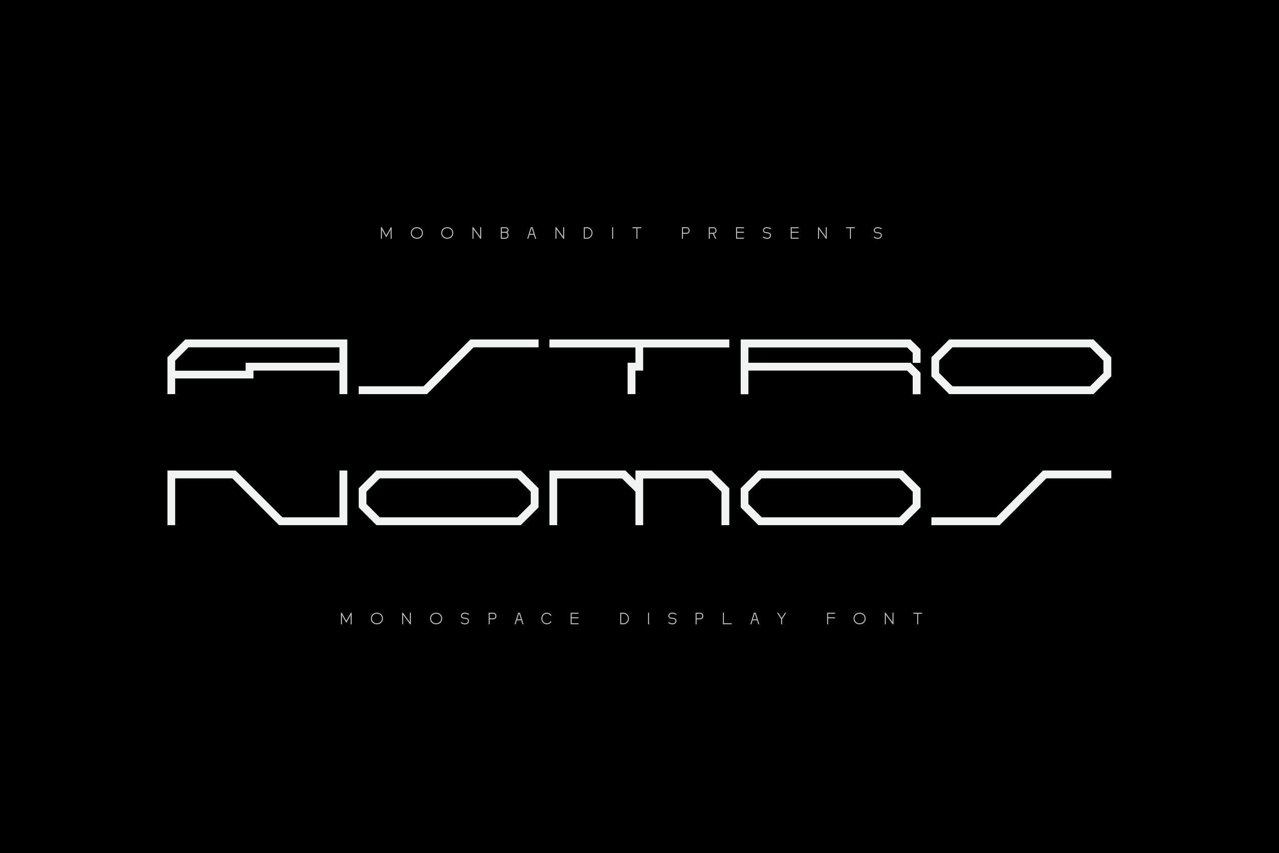
This geometric face has an astronomical, engineering-inspired feel. It suits space exploration, hard science fiction, and near-future stories. Its clean, uncluttered shapes make it one of the easier sci-fi display fonts to read at thumbnail size.
Best for: space exploration sci-fi, hard science fiction titles, near-future sci-fi covers. By: moonbandit
20. Vexa — by nihadmekdad
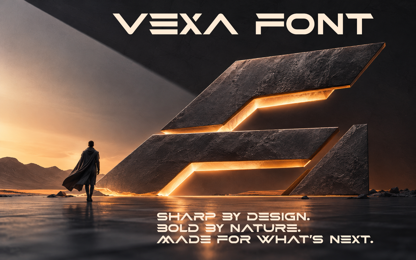
The sharp, slanted letterforms give it a cyberpunk edge. It works for tech-thriller sci-fi and gritty near-future series. Neon-adjacent color choices, like cyan or magenta, tend to reinforce the cyberpunk mood this font already carries.
Best for: cyberpunk titles, tech-thriller sci-fi covers, dystopian near-future series. By: nihadmekdad
21. Solar Space — by 177Studio
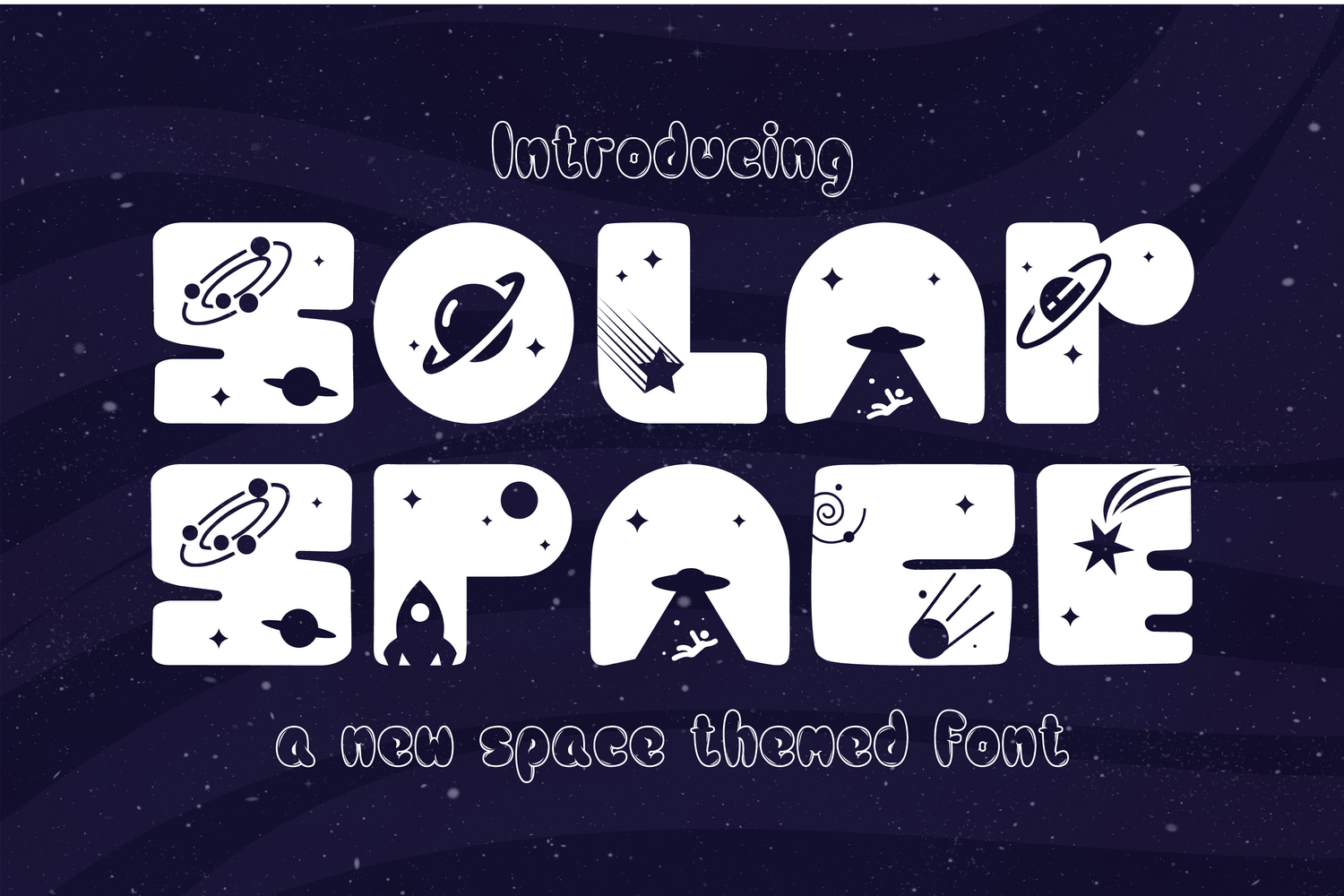
This retro-futuristic display face has a classic pulp space opera feel. It suits vintage sci-fi and nostalgic space adventures. It sits comfortably alongside illustrated cover art, which is common in this corner of sci-fi publishing.
Best for: retro-futuristic sci-fi titles, pulp space opera covers, vintage sci-fi series branding. By: 177Studio
Best Fonts for Non-Fiction & Literary Book Covers
Non-fiction and literary covers need to feel trustworthy. The type should support the author’s authority without turning the cover into a decorative poster.
22. Oldink — by vladfedotovv
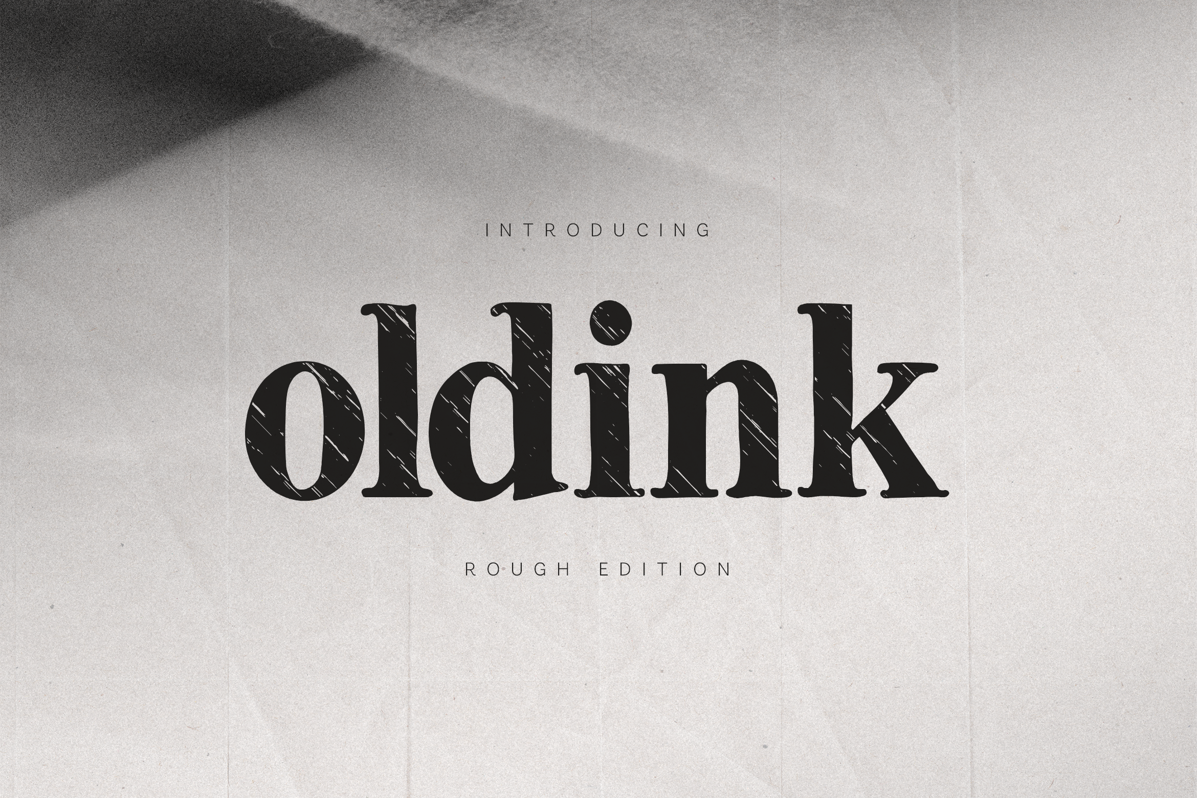
This classic old-style serif has a light vintage texture. It feels trustworthy and literary, which suits historical non-fiction and memoirs. Pair it with generous white space rather than busy cover art, since restraint reads as credibility in this genre.
Best for: literary fiction titles, historical non-fiction covers, memoir book branding. By: vladfedotovv
23. Firanza Display — by putracetol
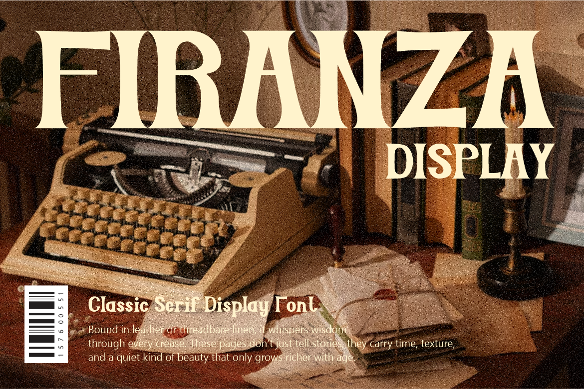
The high stroke contrast gives it an editorial look. It feels like a prestigious literary journal headline and suits essay collections. Because the thin strokes can thin out further at small sizes, keep the title size generous rather than shrinking it to fit a crowded layout.
Best for: literary fiction titles, essay collection covers, editorial-style non-fiction. By: putracetol
24. Acthirey — by roomspace
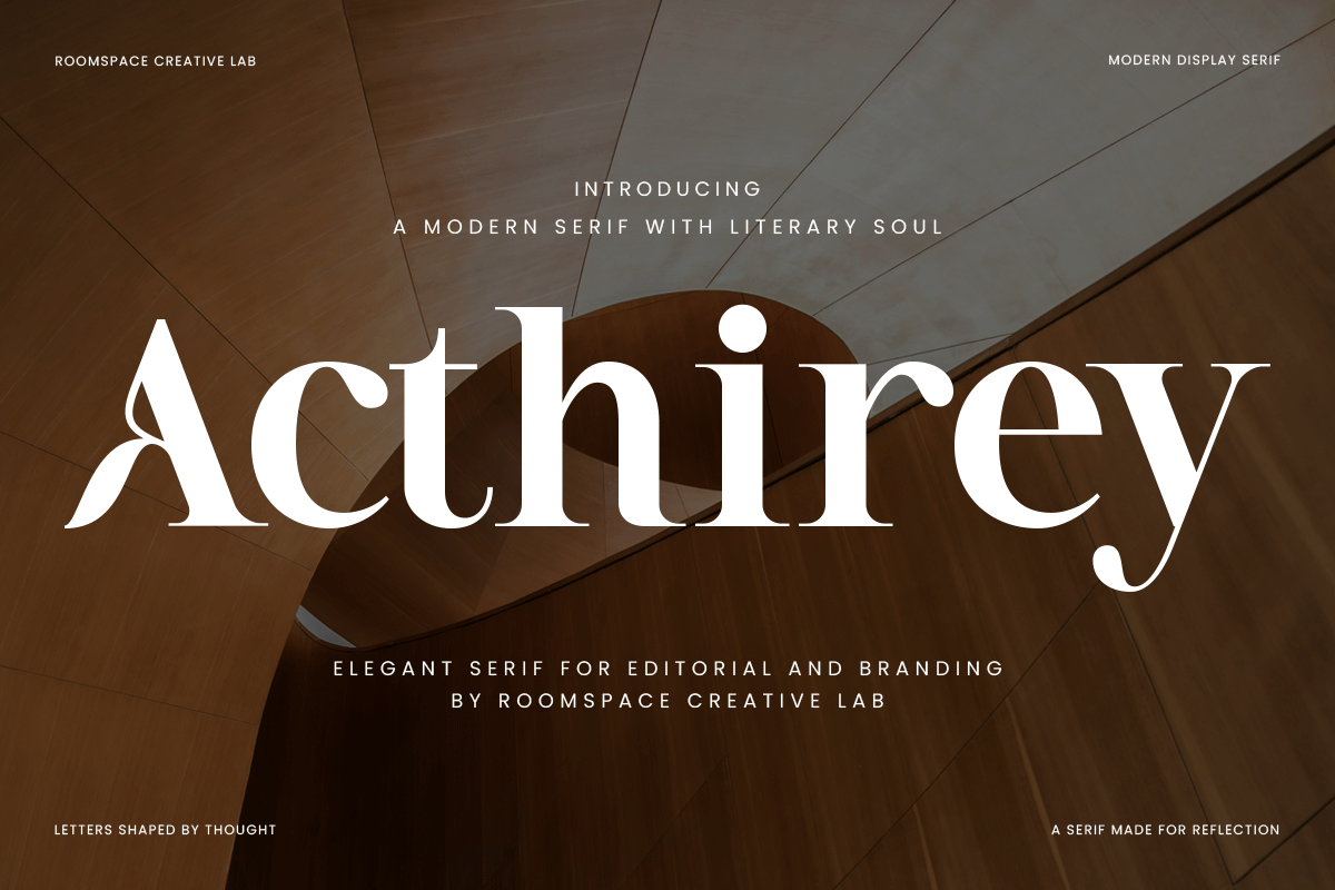
This modern, clean serif balances classic authority with a fresh feel. It suits contemporary literary fiction and self-help non-fiction. Its clean structure also makes it a safe, versatile pick for a series where several titles need to feel consistent.
Best for: contemporary literary fiction, self-help non-fiction covers, modern memoir titles. By: roomspace
25. The Bold Typewriter — by WNIdesign
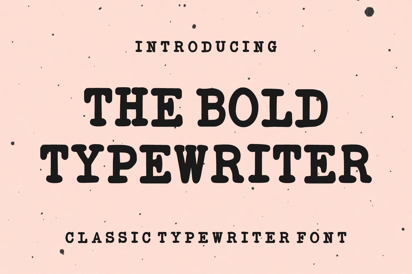
The heavy typewriter style feels like printed truth. It suits journalism, true stories, biographies, and investigative non-fiction. A slightly imperfect baseline, if the layout allows it, reinforces the documentary feel without adding any real design complexity.
Best for: journalism/true-story non-fiction, biography and memoir titles, investigative non-fiction covers. By: WNIdesign
26. Romantype — by Eystore
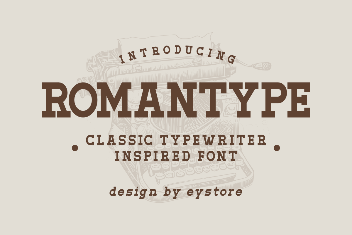
Despite the name, this is not a romance script. It is a serious, warm literary serif for upmarket fiction and book club titles. The warmth in the letterforms helps a serious cover avoid feeling cold or overly academic.
Best for: literary fiction with romantic undertones, book club fiction covers, upmarket fiction titles. By: Eystore
27. Rustic Endstory — by qrdesignstd
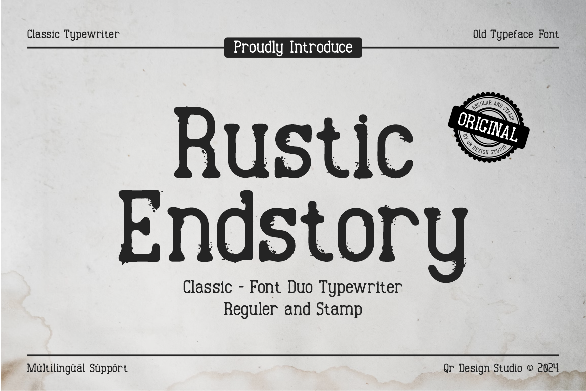
The worn, book-like texture gives it a rustic feel. It suits memoirs, rural heritage non-fiction, and stories about family and place. Photographic covers with warm, sepia-leaning tones tend to complement this texture better than crisp, high-contrast art.
Best for: memoir titles, rural/heritage non-fiction covers, storytelling-driven literary fiction. By: qrdesignstd
28. Ravonte — by Colourful
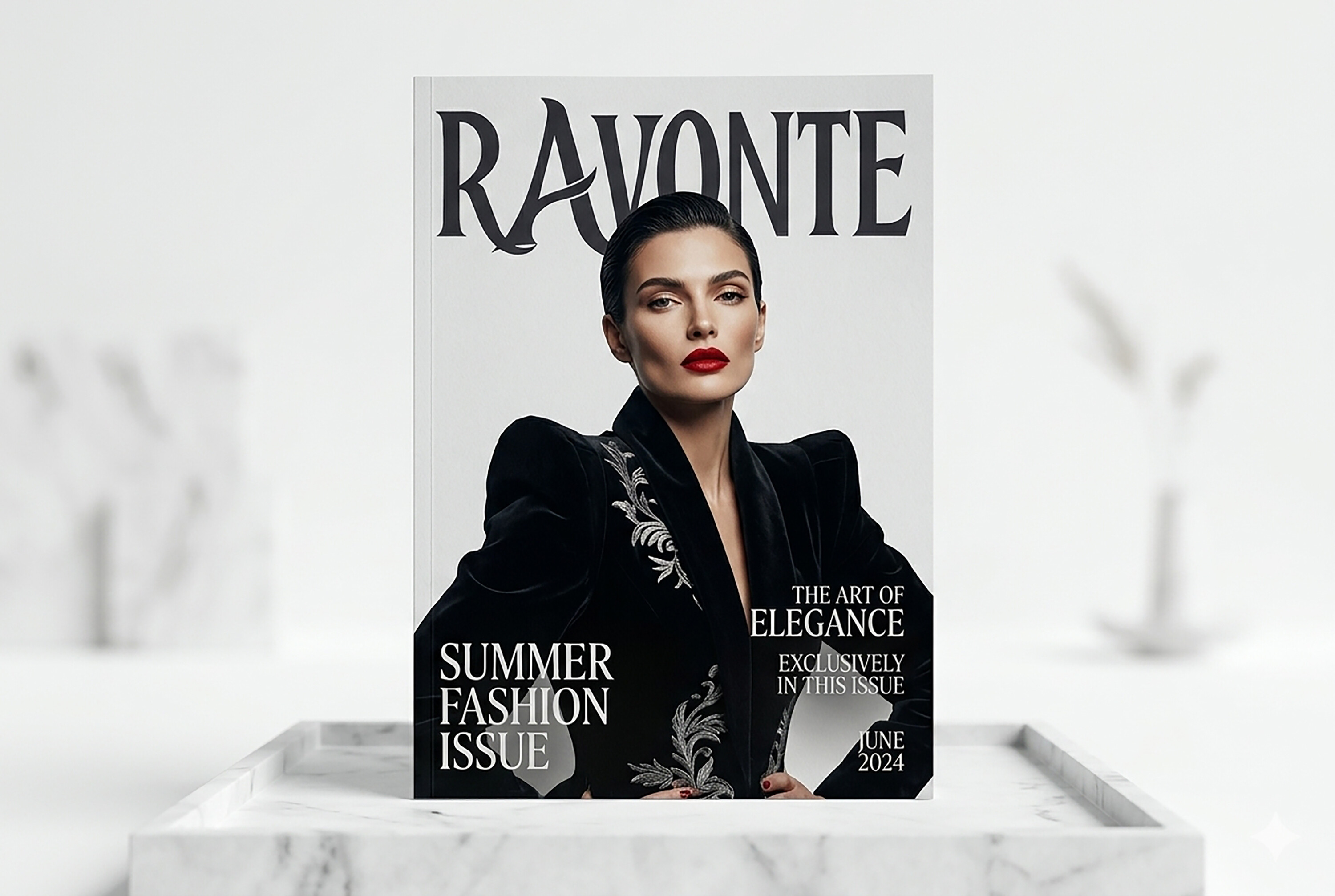
This elegant display serif has a premium, award-nominee feel. It suits classic literary fiction and prestige non-fiction covers. A restrained one or two-color palette usually suits it better than a busy, illustration-heavy cover.
Best for: classic literary fiction, award-nominee-style covers, prestige non-fiction titles. By: Colourful
How to Use Fonts in Your Book Cover Design Projects
Start with the title. It should get the largest size, the strongest contrast, and the most genre-specific character. The author name and subtitle should sit below it in a quieter face. A simple serif or sans-serif usually works well there.
A reliable font pairing for book covers uses one display or genre font and one neutral supporting font. The display face carries the mood. The supporting face handles the author name, series line, or tagline. If you are short on time, a ready-made font duo can save you from pairing from scratch.
Tip: Shrink the cover to about 100 to 160 pixels wide and check whether the title still reads. If the letters merge, reduce decorative detail, increase the size, or choose a cleaner face. High-contrast text over the background reads best at small sizes. Avoid pale text on pale art unless the letters are very thick.
Run the thumbnail test more than once. Check it on a phone screen in normal daylight, not just on your monitor, since screen brightness changes how thin strokes hold up.
Place your shrunk mockup next to two or three bestsellers in your genre and see if your title still competes for attention at the same size. If the title is the only element that gets lost, the font is the problem, not the cover art.
Keep one consistent mood across the cover. If the title feels futuristic, do not pair it with a historical serif. If the title is romantic, keep the supporting face warm and readable. Consistency helps the cover feel designed rather than assembled. When in doubt, make the title bigger and reduce decorative details.
For tools, Adobe Photoshop and Adobe Illustrator are strong choices for professional cover layout. Canva, BookBrush, and Kindle Cover Creator are practical options for self-published authors without deep design experience. You can install the font on your computer, then use it in any of these tools. Test the final composition at both full size and thumbnail size before export.
Building a clear title/author/series hierarchy is mostly about size and contrast, not decoration. The title should be the largest and boldest element on the cover, since it is the first thing a browsing reader needs to register.
The author name should sit at roughly a third to a half of the title’s size, in a plainer weight, so it reads as a credit rather than competing headline. If your book is part of a series, the series name or number usually works best as the smallest, quietest line, placed consistently in the same spot across every cover so returning readers can spot the next book at a glance.
Tips for Choosing the Right Book Cover Font
Start by studying 10 to 20 bestsellers in your genre on Amazon. Do not just look at colors. Notice the book title fonts, the weight of the letters, and whether the covers favor scripts, serifs, sans-serifs, or distressed displays. Readers have learned to read genre through typography, so a wildly off-convention choice can confuse the very people you want to attract.
Keep a running swipe file of covers whose typography catches your eye, sorted by genre, and revisit it before every new project. Genre conventions also shift year to year. Book cover design trends in 2026 lean toward bolder, higher-contrast title treatments and simpler author-name typography compared to a few years ago, so it is worth refreshing your swipe file periodically rather than relying on older references alone.
Then balance genre convention with shelf presence. You want the cover to feel familiar enough to signal the right category, but distinct enough to stop a scroll. A small detail can do that work: a sharper serif, a textured edge, a tighter tracking, or a more dramatic swash. That is how you make the title memorable without breaking the genre.
Licensing is the part many self-published authors skip until it becomes a problem. These fonts are not automatically free for commercial use just because you can preview them. Many free fonts for book covers are personal-use only. Creative Fabrica products include license terms, so check the specific license before publishing a book for sale. Dave Chesson, Founder and CEO of Kindlepreneur, has pointed out that many fonts found online are labeled free but are actually personal use only. If you are unsure, buy the commercial license or choose a font with a clear commercial-use statement.
Read the license the same way you would read a contract, because the details vary by seller and by product. Some commercial licenses cover print and ebook sales without limit, while others cap the number of copies or charge more for merchandise, audiobook covers, or box-set compilations. If you plan to reuse the same title font across a series, a boxed set, or spin-off merchandise later, confirm upfront that the license you are buying covers all of those uses, since upgrading a license after the fact is more of a hassle than checking once at the start.
Test the font with your real title, not lorem ipsum. Long titles, short titles, all-caps titles, and titles with numbers behave differently. A face that looks elegant with a two-word title may collapse with a six-word title. Keep the total count to two or three fonts: one for the title, one neutral face for the author name or subtitle, and maybe one small accent only if it truly helps.
Also consider emotional register. A poignant romance needs warmth, not a cold retro display, unless you are deliberately aiming for irony. For KDP book cover fonts, the safest workflow is to choose the genre, test the title, confirm the license, and then export.
Where to Download Fonts for Book Covers
Creative Fabrica is the main source for all 28 fonts above. Its commercial-use licenses are suitable for print and ebook sales. Google Fonts and DaFont are useful for experiments and rough mockups, but always confirm the license before publishing. Keeping a clear license record also helps when you update the cover, file names, and metadata later. For more genre-specific font roundups and cover design guides, browse the FontPro blog.